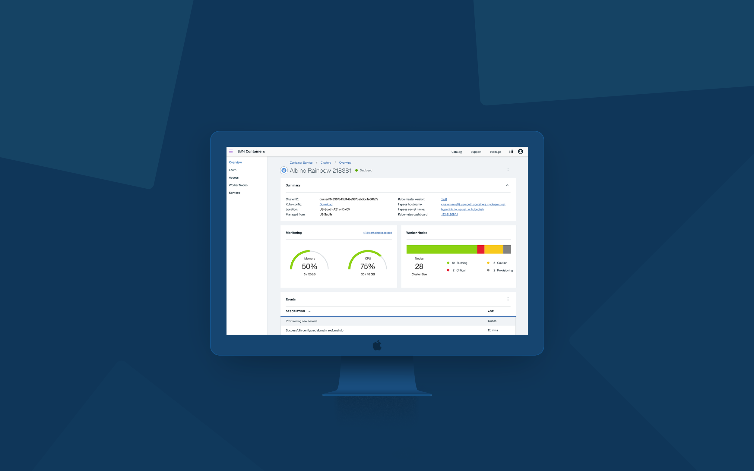
IBM Bluemix Containers UI
Containers is a technology a developer uses to place pieces of code in. Those containers are then put in different places. Why would anyone do this? Less downtime, fewer failures, happier end users.
With just 4 people and 4 months, our team went from doodling on post-it notes to going live. We did this by learning as much as we could about the container orchestration technology, finding out our user’s needs, and then designing around those needs.
Being a new product, we had to start from the ground up. Our team worked together to prioritize what was most important to our user through testing and reiteration.
I made sure everything was aligned, organized, and in an order that made it easy for our user to navigate . There is a lot of information our users want to see and arranging all of that in a limited amount of space was not always easy. I worked closely with our front end developer creating different concepts and styles for each page, which we would then prototype, and test.
HILLS
Hills are statements of intent written as meaningful user outcomes. They tell you where to go, not how to get there, empowering teams to explore breakthrough ideas without losing sight of the goal. We used these to set goals on what we wanted our designs to communicate. These were some of the Hills we wrote.
Who - Who are your users? Make it clear who you aim to serve—and who you don’t.
What - What’s the need they’re trying to meet? Turn user needs into project goals.
Wow - How will you differentiate from competitors? How will you measure success?
Allow developers to create a kubernetes cluster and attach persistent storage, while understanding of cost.
Allow developers to access their cluster and add pod workloads, while making claims against the attached storage.
Create a way for Bluemix developers to use the container technology when creating and deploying applications..

Create Container
Below, is an empty state / create page, that every first time user will see. I saw this as an opportunity to create an illustration to reflect our brand’s personality and make their experience a little more pleasurable.
We were the first team on Bluemix to include illustrations in our service and received great feedback from it.
Container Overview
After creating your first container, this is what your dashboard should look like. A quick overview of what our users felt was the most important information, that they can skim through easily.
Learn - Cluster Tutorials
When your container is provisioning, there will be tutorials you can read over as you wait. Giving our user additional information about what they can do with their container.
Access Page
The Access Page provides the user step by step instructions to gain access to their cluster.
Worker Nodes
On the Worker Nodes page is where the user can reboot, restart, update, delete or add to their nodes. Quickly able to scan the information they are looking for, and click into individual ones to get more information.


